


PIXLISE
PIXLISE streamlines the search for life on Mars by helping scientists understand data from PIXL (Planetary Instrument for X-ray Lithochemistry) on NASA's Flagship Perseverance Rover. It astrobiologists flexible and powerful visual analytics tools to quickly analyze and understand high-density, spatially-localized, imaging and XRF spectroscopy data.
All in service of helping the Mission Lead decision-makers answer the difficult decision: “Which rock samples should we designate as the most critical for return to Earth, if we can only return 38?”
My Role
I worked as the product and visualization designer for 7 years, from the initial stages of whiteboard sketching, through discovery research, UX research, prototyping, user testing, wireframing, and high fidelity design.
Most importantly, I worked to cultivate trust between vastly different user groups, as well as our engineering team, creating a foundation for innovation.
Science is a Team Sport
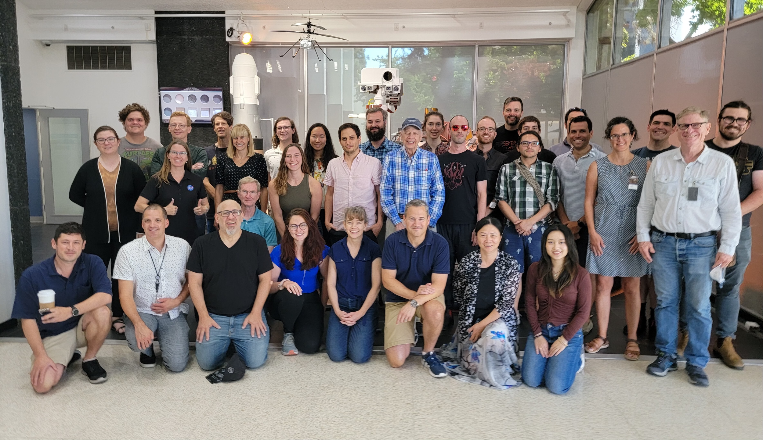
PIXLISE was founded as a collaborative effort, and remains that way today. The core product team consists of 4 engineers, 1 PM, and 1 designer.
Our science team consisted of 4 Primary Investigators at NASA JPL, and a team of about 50 scientists, and 5-10 PhD candidates. The fusion of scientific expertise with cutting edge software development and design, carried out in a high-trust environment is what makes PIXLISE unlike any other tool.


Data Isn’t Useful Until you See the Answers in the Noise
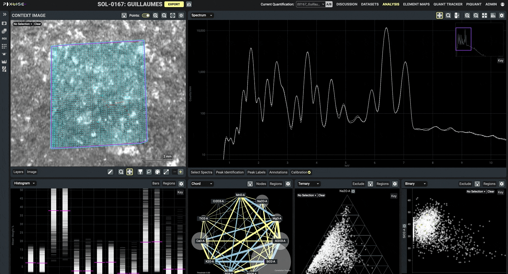
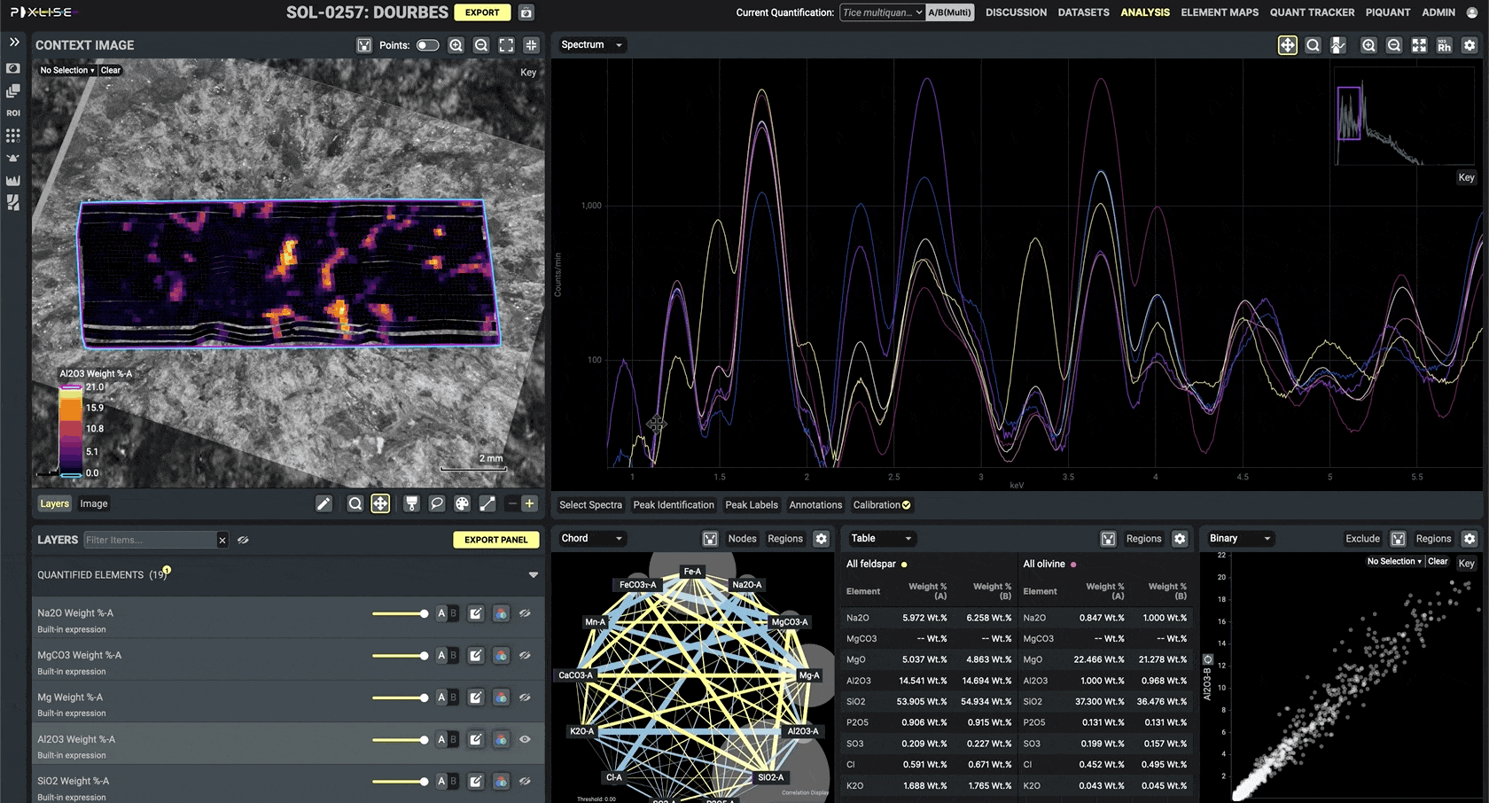
PIXLISE is an interface informed by thousands of hours of collaboration between geoscientists, visualization designers, UI engineers, and big data cloud computing innovators. With intricately-connected features, colorblind-safe palettes, and customizable plot panels, PIXLISE’s flexible user interface empowers the modern scientist with an innovative workflow, allowing for groundbreaking insights and discoveries.
PIXLISE is a quantum leap forward in the visualization and investigation of spectroscopy data. Equipped with the ability to spin up massive AWS assets to instantly analyze hundreds of thousands of data point, and a visualization suite built over 7 years of intense collaboration between the world’s leading astrobiologists and software experts, this tool combines accuracy and speed as never before experienced in the field.


Evidence of Impact
PIXLISE has revolutionized our understanding of spectroscopy, Martian history, fundamental x-ray physics, computational algorithms, and data visualization. PIXLISE work has been featured on the cover of Science, as well as leading articles in Nature, The Space Science Review, COSPAR, Radiation Physics and Chemistry, ACM CHI, and other prestigious academic journals. Its insights have supported dozens of successful presentations, conference papers, and articles. It has also won JPL Software of the Year in 2023.

Feature Highlight: Interconnection
Every view in PIXLISE responds to input into any other view instantly, allowing the scientist to investigate recognize patterns in multiple dimensions. Selecting a scan point in based on geospatial location automatically shows its spectra, elemental composition, and relative distribution. Alternatively, a geoscientist could select for points that have a high concentration of a single element, and immediately have those scans selected in the geospatial view. One of PIXLISE’s foundational principles is that every view should be alive, responsive, and interconnected.

Feature Highlight: Flexibility
Every investigative UI in PIXLISE defaults to a thoroughly validated general layout and state so that it is immediately useful. However, the needs of our highly diverse science team simply cannot be supported in one unified view, so PIXLISE provides both customizable layout templates, and the ability to place any of our 13 different visualizations at any location in the view.

Design by Elysha Tsai
Global Accessibility and Personal Design mentoring
Several years into the project, our PIXL Primary Investigator Abigail Allowed recognized that despite PIXLISE’s history as a tool to analyze the martian surface and samples returned from it; its functions are applicable (and potentially revolutionary) to spectroscopy labs around the planet. She tasked me with mentoring an outstanding Visual Communications Designer, Elysha Tsai, to look our research tool, and find a way to communicate its massive complexity and innovative power to new labs in the form of a well structured landing page and explanatory website in just 10 weeks. I supported her through all phases of the design process and her outstanding work is used today as the welcome page for the tool, please feel free to check it out, and also take a look at her portfolio!