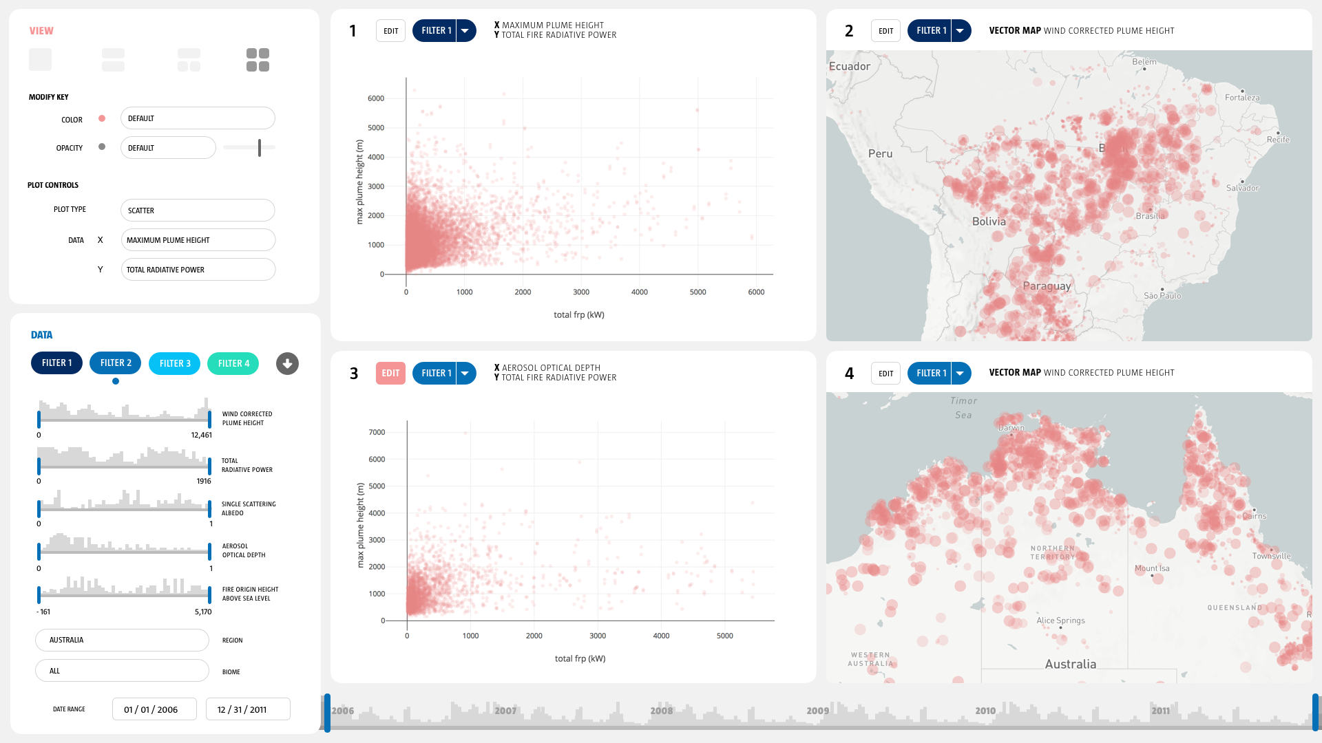
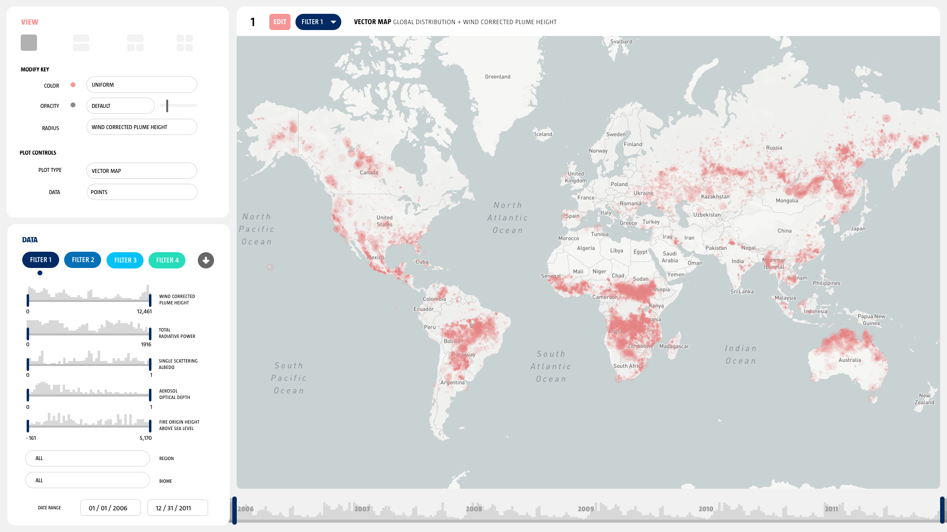
MERLIN is a specialized data visualization software designed to enable exploratory research of geospatial wildfire smoke plume data for climate and atmospheric science researchers at NASA’s Jet Propulsion laboratory.
Adrian Galvin [design], Jarod Boone [CS], Pooja Nair [design]
10 week project.
MERLIN enables NASA researchers to ask better questions questions and spend their time concentrating on scientific inquiry as opposed to data manipulation. The software allows them to survey, parse, filter, compare, and explore their unique remote sensor data rapidly.
The Mission
The Multi-angle Imaging Spectro-Radiometer (MISR) team at the NASA Jet Propulsion Laboratory is a group of engineers, scientists, and data specialists who manage and distribute a key data product produced by the MISR instrument aboard the TERRA satellite which enables climate and atmosphere research around the world.
TERRA was launched in 1999, and what were state of the art data storage and access procedures at the time are now less than cutting edge. MISR has produced a data base 52,000 wildfire smoke plumes and 67 variables for each fire including height, fire radiative power, and albedo. This is an extremely valuable data set for many scientific endeavors: the creation, maintenance, and modification of global climate models depends on information from the MISR fire plume data set. We need to provide scientists as much data access as possible in order to accurately understand anthropogenic climate impact, so that we can safeguard our collective future.
But there’s a problem: the MISR fire plume data set is hosted on a limited access server as a set of 56,000 individual ASCII text files. The interface for searching this data base and gaining access to this critical data set is out of data, difficult to use and does not provide sufficient visual feedback to allow scientists outside of the MISR team to utilize it for their research.
Orientation : TERRA
TERRA is NASA’s flagship earth science research satellite, launched in the payload of an Atlas V heavy lift rocket in 1999, it’s mission is to explore connections between Earth’s atmosphere, land, snow and ice, ocean, and energy balance in order to understand Earth’s climate, climate change, and map the impact of human activity and natural disasters on communities and ecosystems.
MISR is just one of several instrument that she carries on her mission to understand Earth as a system. TERRA collects multiple data types which are relevant to climate change, ecosystems, carbon cycle, water cycle, weather, surface composition and atmosphere composition.
Orientation : MISR
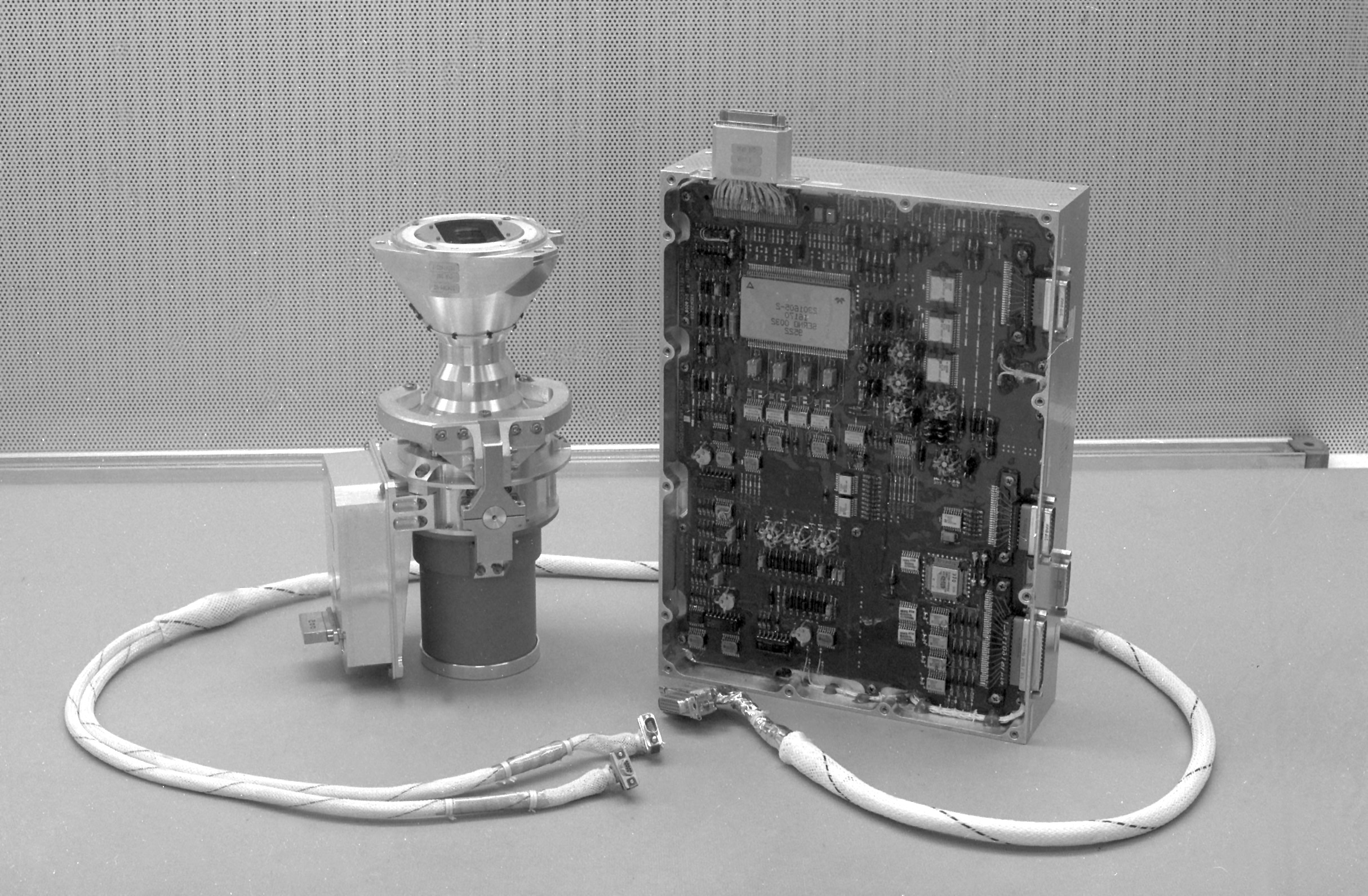
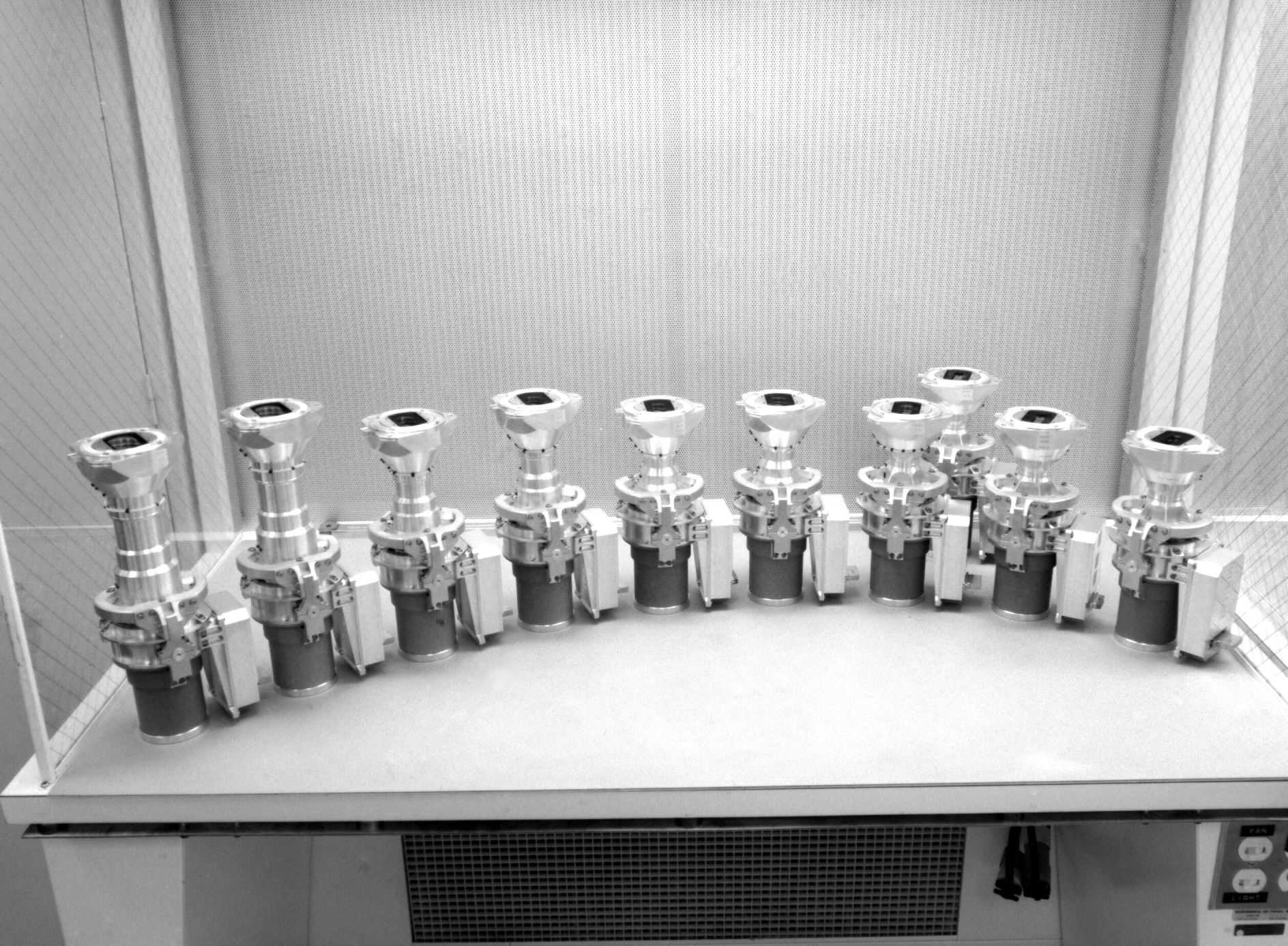
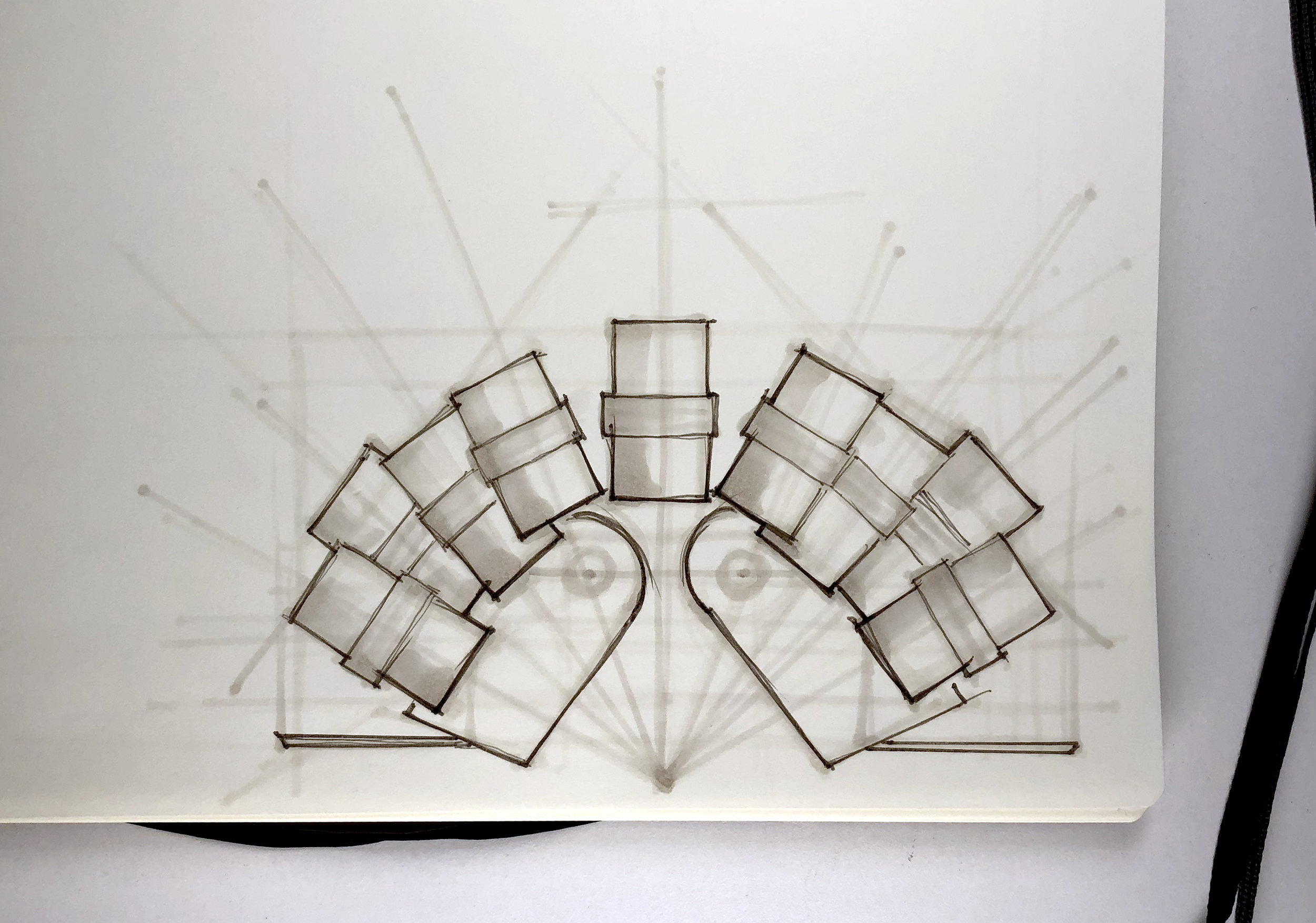
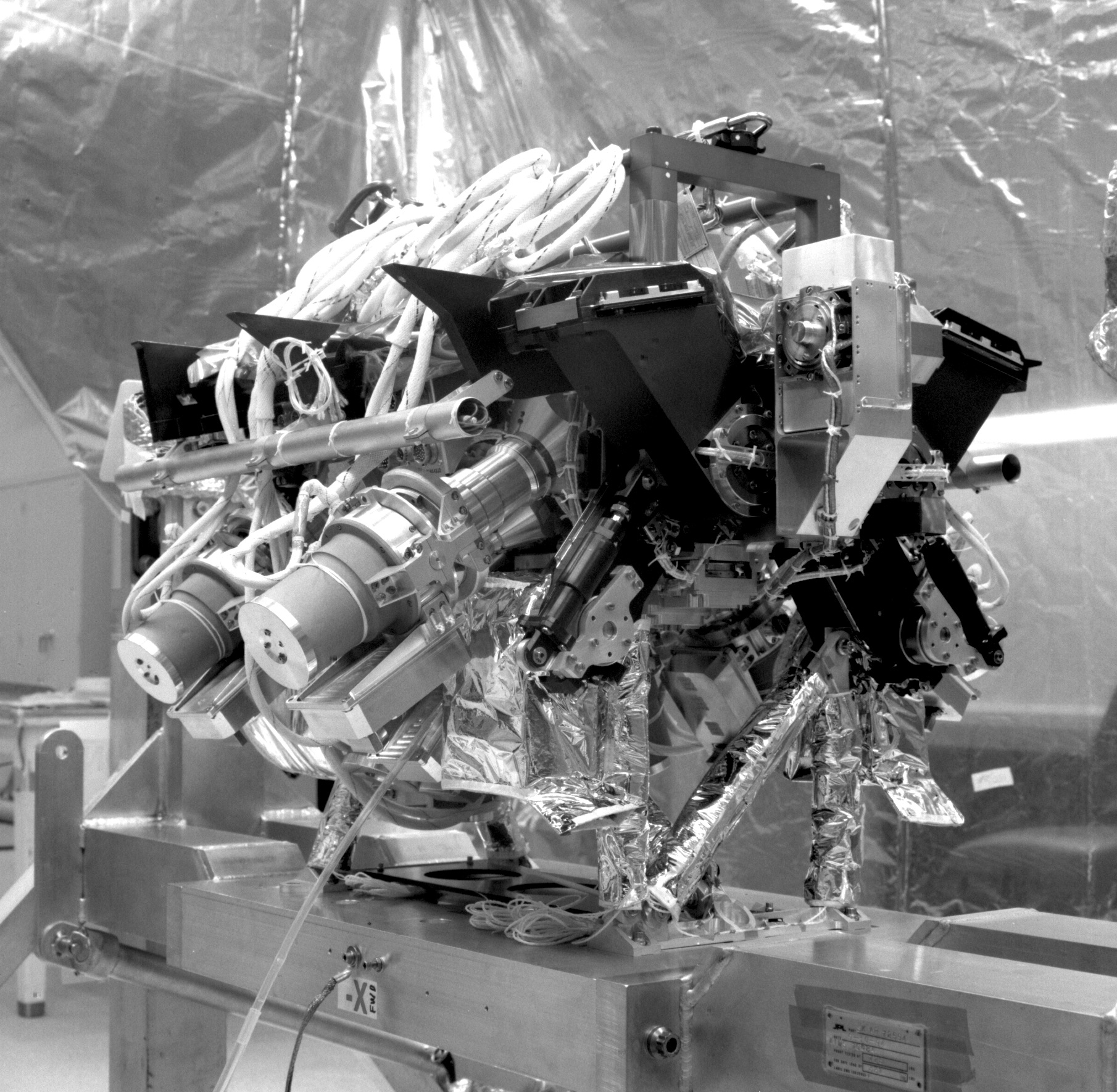
MISR is a unique satellite instrument composed of 9 differently angled cameras. As TERRA flies over objects, each of MISR’s cameras see the object in succession. Using stereoscopic reconstruction techniques, scientists can then discover the height of objects measured from the surface of the Earth. Most instruments that can measure object height do so actively, using a radar or X-ray beam and measuring the reflected energy. This technique delivers excellent accuracy, however the beam swathe of such an instrument is quite small, on the order of meters. MISR is unique because its sensor swathe is nearly 300 miles wide, which allows it gather significantly more data than an active instrument.
MISR is able to view many more fires than other instruments on other satellites, the MISR fire plume data set is significantly larger than any other plume data set. Enabling researchers around the world to access this data set would allow them to investigate a much larger pool of data.
Contextual Inquiry
Designing data related cognitive tools for science research requires careful inquiry and understanding on the part of designers. It was a joy and privilege to be able to think about problems of this kind of complexity. In order to design an appropriate visualization system, we participated in hours of meetings, workflow demos, and exploratory interviews. We sketched, mapped, and discussed among the design team and with the science team in order to build a clear picture of their pain points, needs, workflow and the opportunity space.
Science Concepts
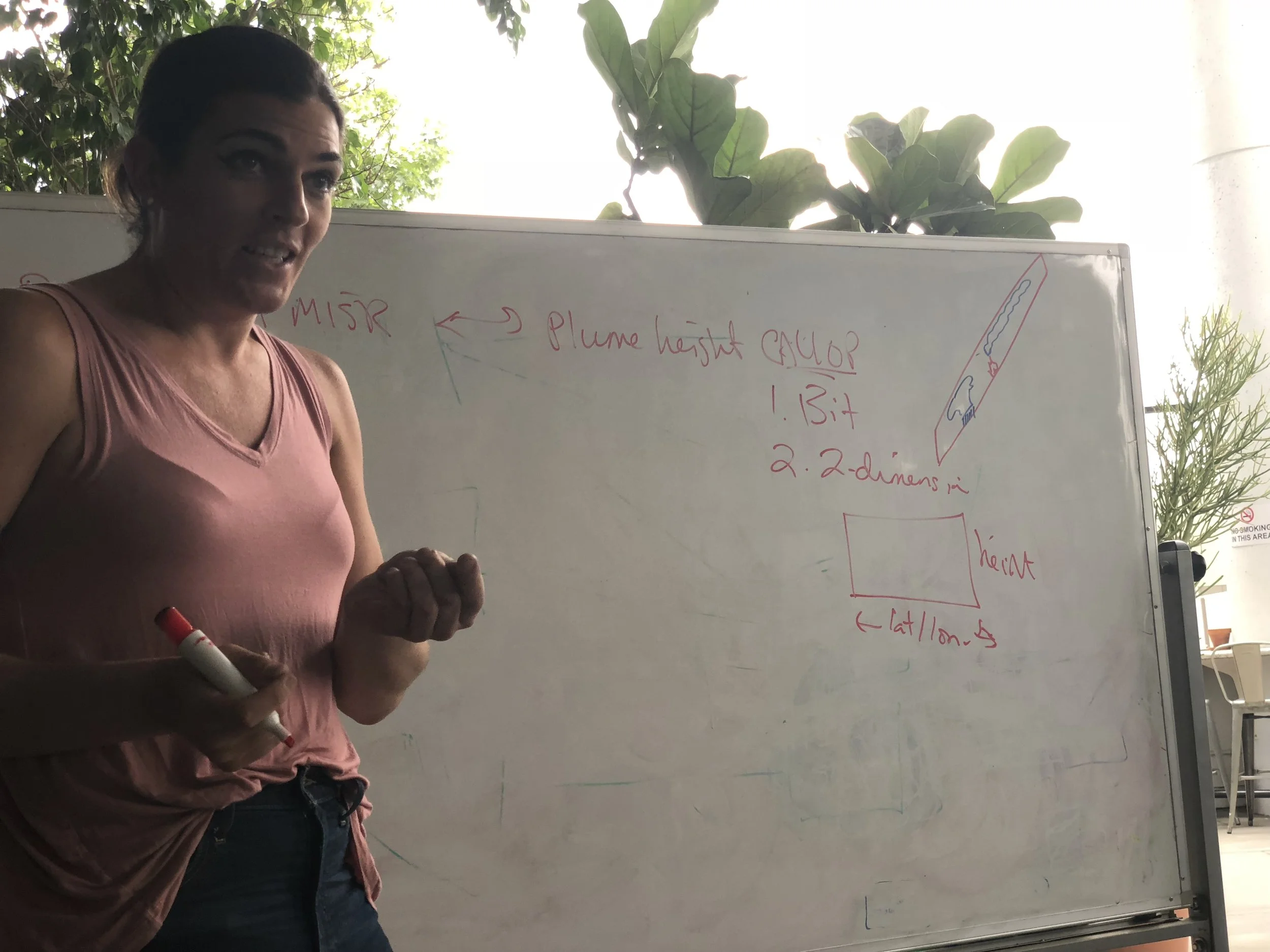
In order to understand what to build, we had to get up to date on everything that the science team does. From polar orbits, to the atmospheric boundary layer, and the intricacies of MISR, we had to learn it all rapidly and reflect our learning back to the scientists in order to ensure that our understanding was clear before we got down to making software.
Data Base Creation
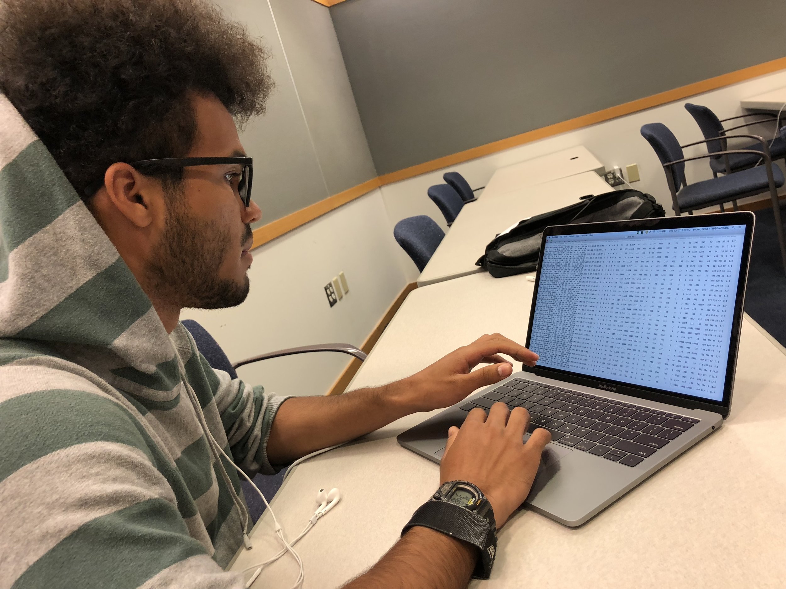
The central problem in this mission was the inaccessibility of the 56,000 data files that comprise the plume data set. Data engineer and computer science wizard Jarod Boone got to work investigating the best way to approach the issue with me. We extensively discussed, weighing the ups and downs of potential approaches and settled on building our own data base from scratch. This would ensure that it could be totally optimized to rapid search, retrieval and filtering.
Jarod created python scripts to download and parse the files, and then built a postreSQL and Django back end so that we could start accessing the data. On top of this robust and responsive back end, we were able to start making our first geographic projections, see the data for the first time and start to think about design ideas.
Ideation and Strategy
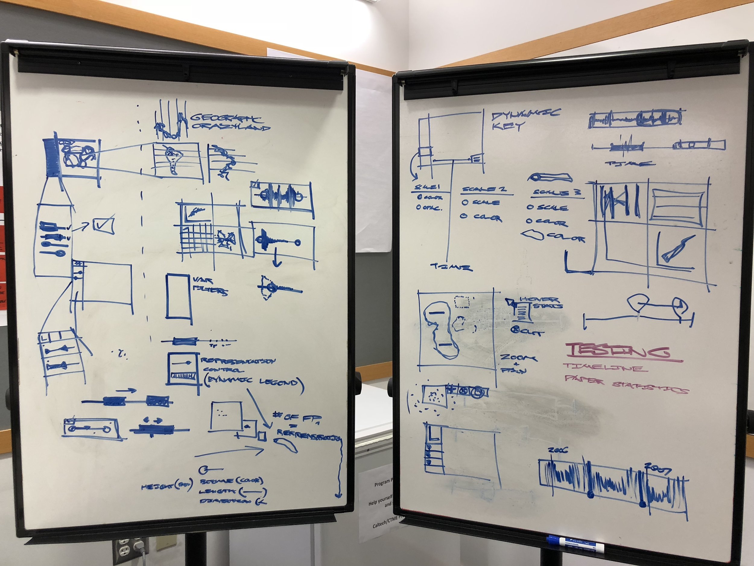
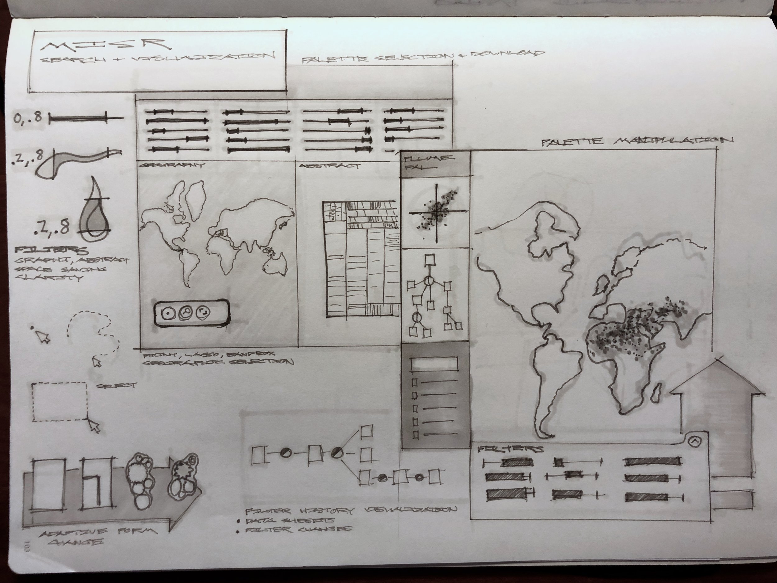
We knew that the scientists needs centered around search, filtering, and visual analysis. But every scientist is doing unique and different research, our tool had to provide very specific functionality, but also retain enough flexibility to be used in several different research contexts for disparate scientific aims. We sketched out some high level ideas and approaches settling on two initial directions: a filtering first paradigm and a visualization first paradigm.
Opportunity and Science Team Challenges
We discovered that for any inquiry into the data set, scientists had to write custom python scripts of their own to query the data set, and also write their own visualization code in order to create even the most rudimentary visualizations. This is a huge amount of science time lost, which could be much better spent thinking about climate change and atmospheric processes.
We explored visual feedback mechanisms, linking and brushing, and different ways to record each of the filter and search steps that scientists were making.
We also discovered that there were two primary and competing use cases that we had to solve for. Many atmospheric scientists followed an approach that utilized statistical comparison of aggregate trends, whereas the climate researchers were interested in creating and checking mathematical models of the climate. Our system had to equally support both high level use cases without sacrificing usability.
Co-design and Deep Dive Interviews
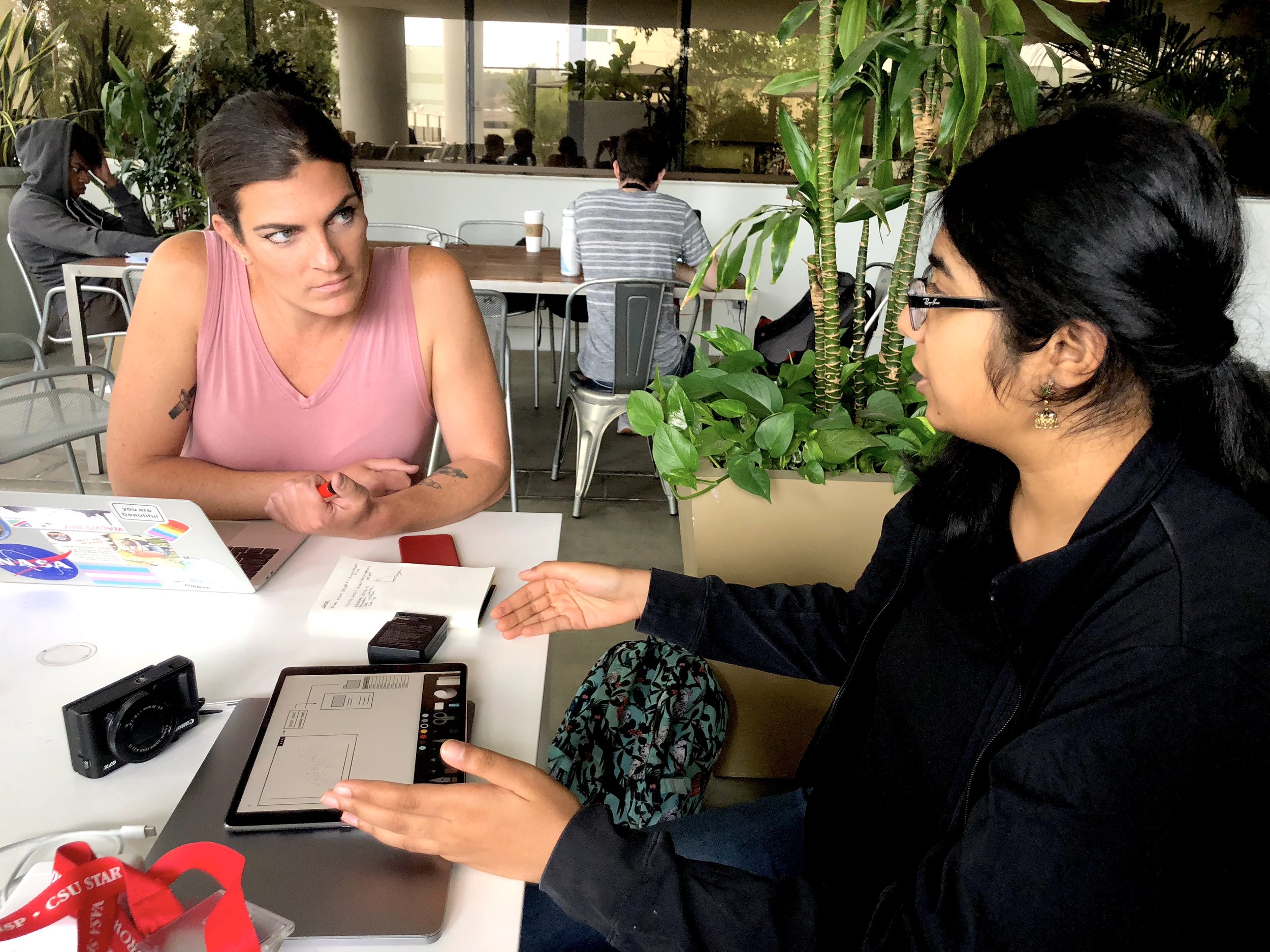
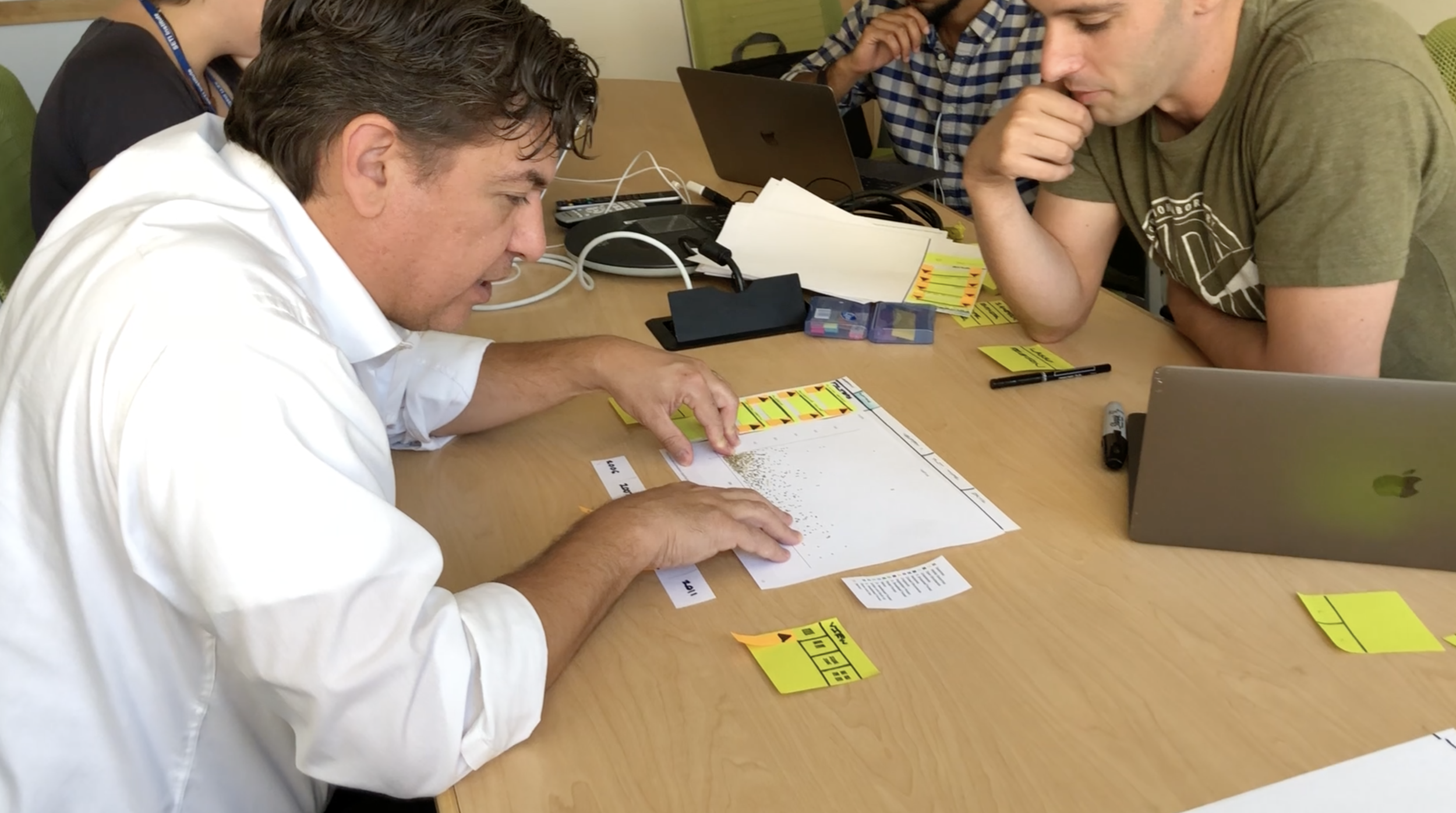
Our team maintained a very close relationship with the science team, and a culture of open collaboration. We organized frequent co-design sessions to bring the scientists into our process and elicit their input. We also conducted observation sessions where we watched them at work, noticing and recording detailed behavior patterns and workflows that went beyond what the scientists were able to reveal to us verbally.
At this point in the process we were able to start to define what we didn’t need to do. Only by observing the scientists in their actual context of work, and creating co-design activities that allowed them to reveal deeper level needs, were we able to start getting granular about what was required of our software.
Our objective was to deliver a fully working prototype by the end of the summer so we had to get very clear about what was required, nice to have, and outside of scope.
Testing and Assessment
Visualization Prototyping
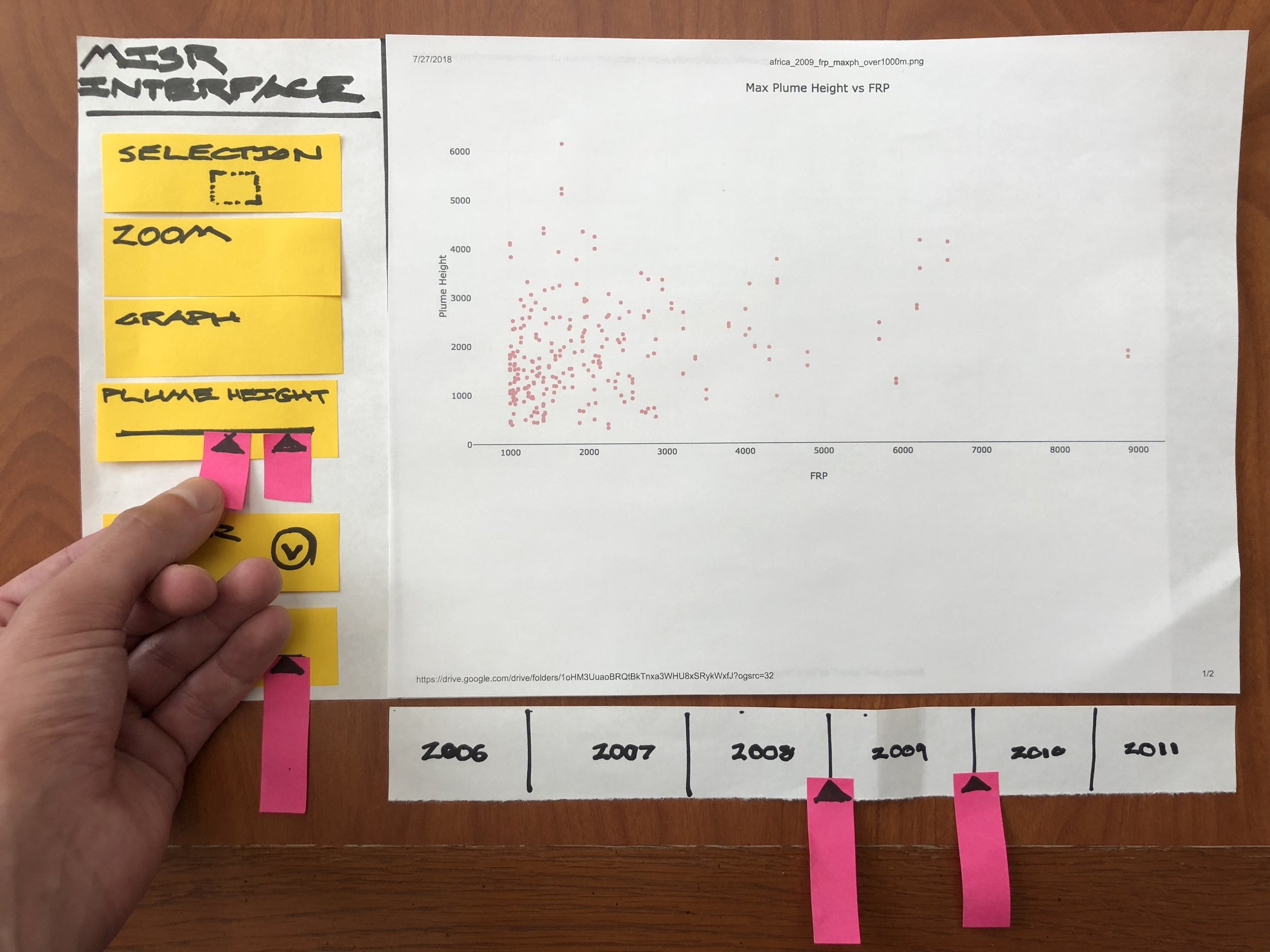
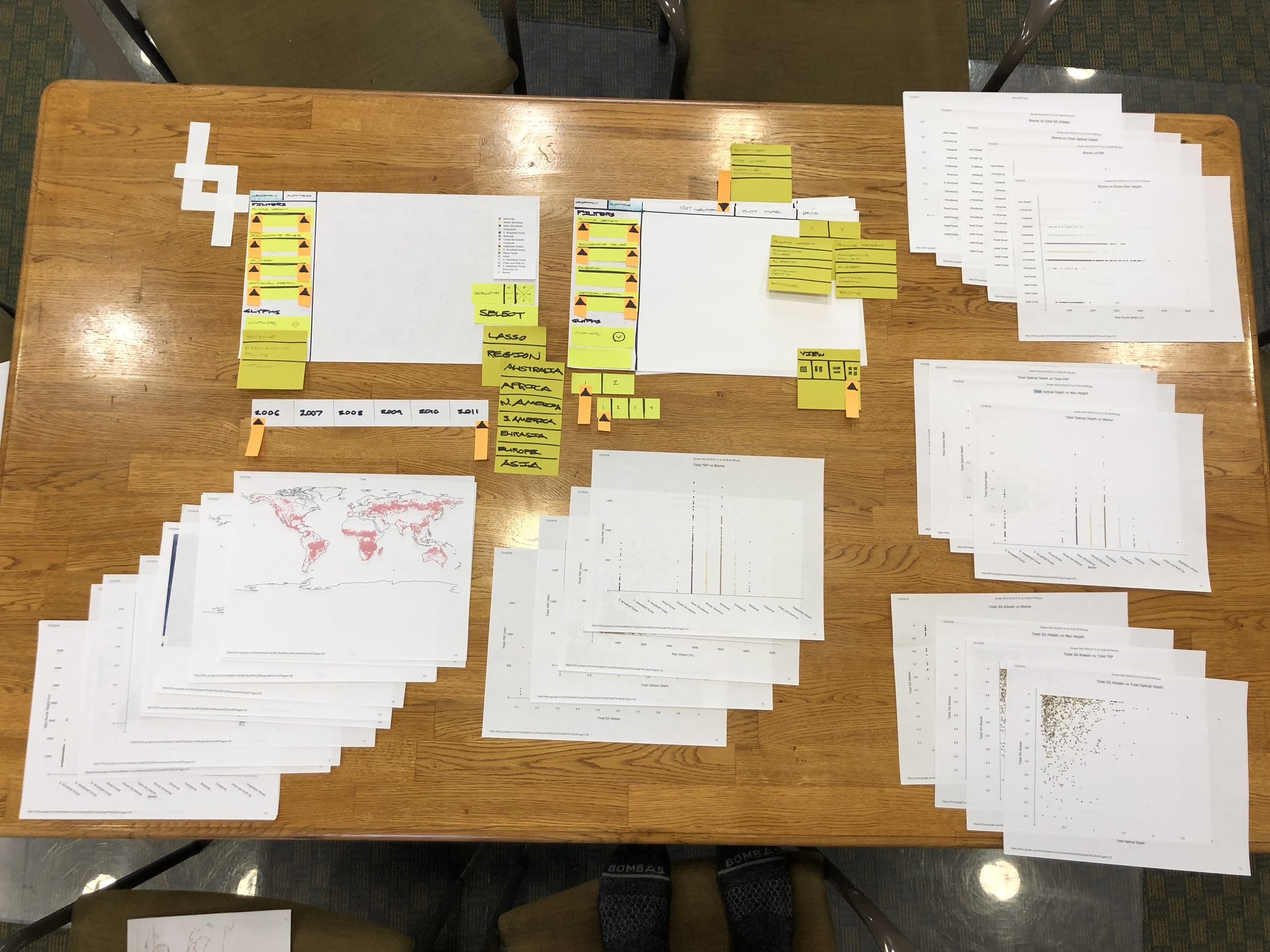
Once we understood the problem, requirements and workflows, we were able to start testing our prototypes. Prototyping for scientific visualization software presents unique challenges for designers. When prototyping for consumer apps, design tools such as framer, origami studio, protoPie and kite compositor provide more than enough fidelity and capability to convey the look, feel and behavior of a design. But when prototyping for visualization, you must use the real data in the prototype. And the representation must be dynamic. The user centered design team at the Jet Propulsion Lab uses a specialized prototyping technique called hybrid or mixed fidelity prototyping.
Jarod worked closely with me to create images from the real MISR data, using the back end system that he had built. We researched realistic research tasks from the published work of the science team, and then created paper prototypes which included full fidelity representations of the data. By keeping the interface representations paper and low fidelity, we were able to get the scientists to focus just on the data and to start to tell us what they saw and what it meant. From this information, we were able to extract accurate and useful interface feedback that was directly tied to the scientist’s real workflow.
Making it Happen
Jarod, Pooja, and I got scrappy and went through many iterations of prototypes. The collaboration between designers and developers gets extremely exciting when both people are helping and enabling each other at the edge of your collective capabilities. I was lucky to get to work with an extremely skillful, handworking, and supportive team. Together we hacked, screenshot, printed, cut, assembled, and planned a sequence of ever more detailed and finely adapted prototypes, responding to the scientists feedback and refining our design.
Alongside the mixed fidelity prototypes for testing, I refined the digital version of the interface, integrating the feedback as we went.
Integrating Use Cases Through a More Flexible Interface
One of our main challenges was solving for the disparate needs of climate and atmosphere scientists. But through several rounds of testing, we were able to develop an information hierarchy, standardized nomenclature, and an overall workflow that integrated both ways of working.
We organized the interface around the approach of exploration and comparison. By abstracting the use cases to this high level, we were able to create an interface that was adaptive and yet specific enough for the whole science team.
Life Beyond our Work
In a short 10 weeks, we were able to go from 56,000 text files, to a working exploratory visualization engine. But there’s so much more that this system could do. We made a pitch to the MISR team project manager, and the software that we now call MERLIN is getting additional funding to expand its capability.
Thank you
MISR science team: Abby, Mika, Mike and Sebastian. Jarod and Pooja. The JPL/ArtCenter/CalTech mentor team.
Photo credits : Caltech-JPL-Art Center Visualization Program and NASA/GSFC/LaRC/JPL-Caltech, MISR Team


